Rethinking CloudAdvisors
As the team’s first UX Designer, I established our design process and spearheaded the first major redesign of CloudAdvisors.
This laid the foundation for many future updates, ultimately helping the company increase its growth. It marked the beginning of a significant phase.
The challenge
CloudAdvisors had moved up from being a place to buy insurance products to a platform that provides valuable data as well to its users, which in turn helps them to take impactful decisions.The old website design failed to effectively meet the additional user needs and expectations, resulting in low engagement and suboptimal user experiences. A redesign was necessary to address usability issues, improve functionality and enhance overall user experience.
My role
I led this project with the support of a team of four, including a PM, two developers, and a stakeholder. As the sole UX specialist, I was responsible for the entire user experience and personally created all the deliverables showcased in this case study, including the visual design. I managed the project from the kickoff meeting to the launch and through multiple rounds of iterations afterwards.
Phase 1
Discovery
Primary & secondary research
The primary objective of the discovery phase is to improve the user experience at the same time, create a visually appealing, intuitive, and conversion-focused homepage that enhances user engagement and drives key business objectives.
Analytics review
I started by analysing our previous data to identify conversion obstacles and user pain points. Users went to the home page and directly went on to use the products in the navigation bar and was not checking out any of the other information there. Despite being in-depth, the home page lacked critical information.
The main usability issues that are identified
The primary focal point for users upon entry was a prominent image lacking relevance or meaningful engagement, ultimately serving as a substantial distraction.
The inclusion of a search bar, does not align with the core functionality or user needs of the product.
Feedback from users
The most important data we had were feedback of the actual users detailing the issues that they are facing. This was recorded by the customer support team from the tickets that they receive from the customers.
The main feedbacks received were
Users lacked clarity on how to navigate between different groups (insured companies).
Users struggled to comprehend the "group" (insured company) that is currently selected.
The presence of excessive content not relevant to user groups.
Users encountered difficulty switching between English and French languages.
Stakeholder Interviews
This initiative had a significant impact on several organisational divisions, some of which had competing interests. To fully grasp the specific needs and concerns of each department inside the firm for the design, I spoke with representatives from Product, Marketing, Sales, Services, Support, and Executive Leadership through interviews.


Key Implementations
1. User-Centered Design: Our design approach will be centered around the needs, preferences, and behaviours of our target users. The issues identified during research were also resolved.
2. Visual Hierarchy and Information Architecture: Establishing a clear visual hierarchy and intuitive information architecture is essential for guiding users' attention and helping them navigate the homepage effortlessly. Important content and calls-to-action will be prioritized effectively.
3. Engagement and Conversion: The design will incorporate elements and features that encourage user engagement and drive desired actions, such exploring product offerings, or initiating contact with our team.
4. Simplified Navigation: The navigation structure will be streamlined and intuitive, allowing users to find information quickly and easily. A user-friendly navigation menu will facilitate seamless exploration of different sections of the website.
Phase 2
Ideate
The data from the discovery phase is analysed in this phase to form ideas that will help form the framework for the design phase.
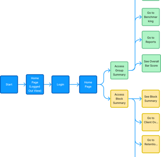
Old userflow

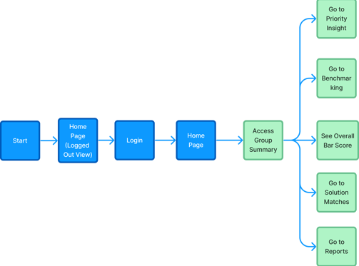
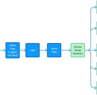
New userflow for User type 1 (Advisors)
New userflow for User type 2 (Benefit user)
After we had a clear direction for the design, I started to create several wireframe iterations.
The fact that we whitelabel our website to match the colours of the customers is something that was constantly in my mind while setting up the design.
After that, I tested and solicited input from users and internal stakeholders on the designs.This process ensured that all the everyone was on the same page.The final approved designs were then moved to the visual design phase.
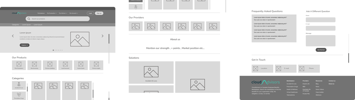
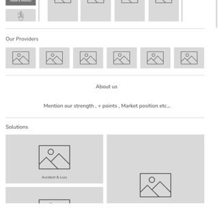
Wireframes
Design
Phase 3
The visual design were created to be pleasing which would create a positive first impression, encouraging users to stay on the site longer in addition to enhances credibility and trustworthiness.
The website was now consistent with clear and visually appealing layouts help users find information quickly and efficiently.The intuitive designs made navigation easier, improving the overall user experience.
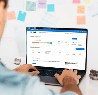
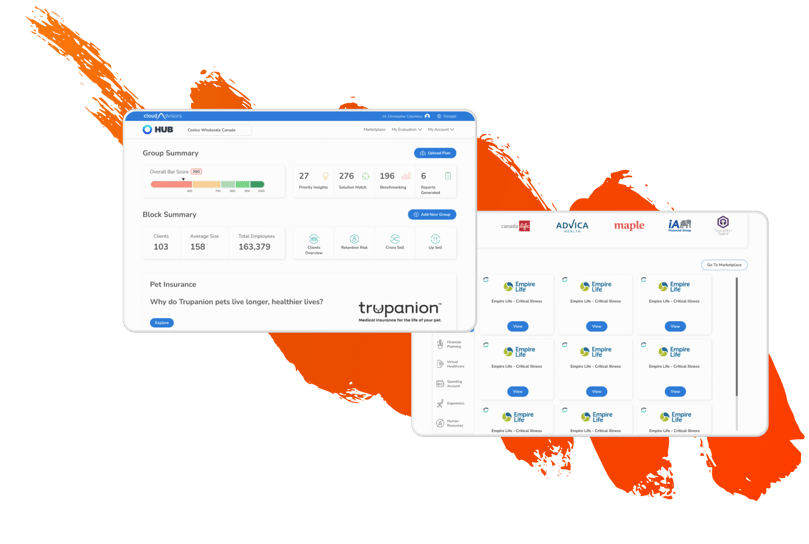
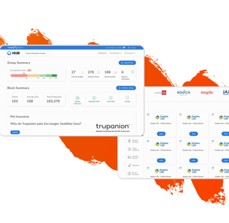
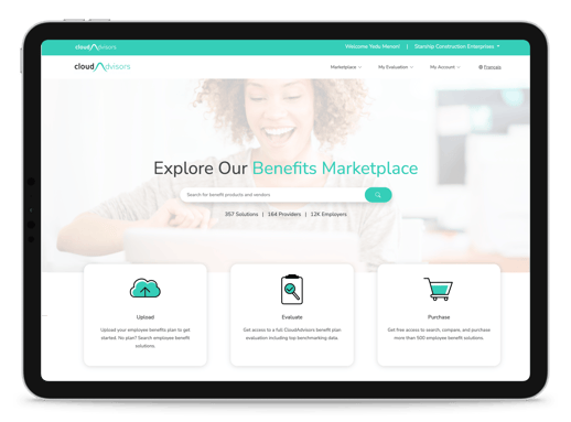
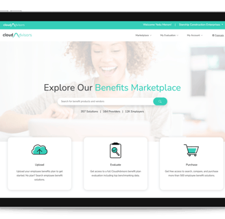
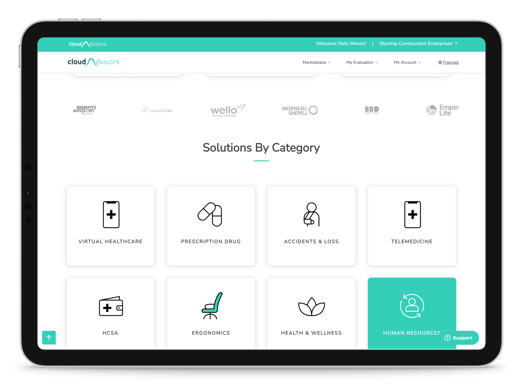
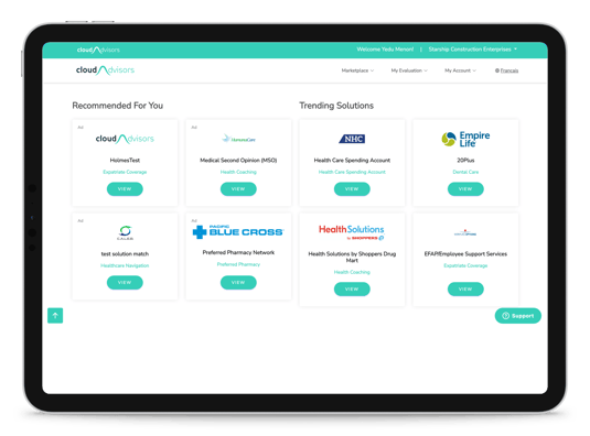
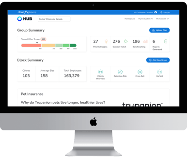
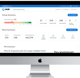
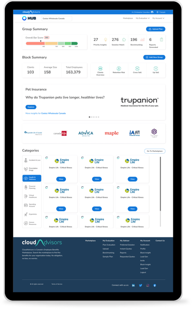
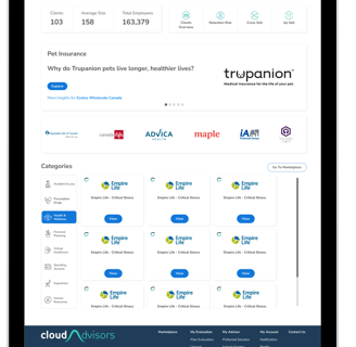
Visual Design
The completed designs and deliverables were given to the engineering team for development.
The developed website then underwent Quality Assurance Test to ensure that the designed version and the developed versions were matching.
Further we also conducted user testing. Selected users were granted access to test out different scenarios they do on a daily basis and to give us feedback.
Phase 4
Test & Iterate